Color profile inconsistencies

zcto7

Well-known member
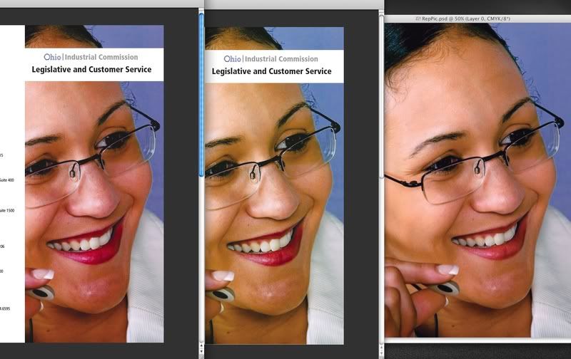
I am having a big problem with my color shifting throughout my workflow. Once my file is converted and ready in photoshop, it looks different in acrobat by the time it hits the proof ready pdf. I thought using the Fogra 39 profile throughout would be fine, but as the screenshots below show, I have 2 different results. retouched version looks good in photoshop, too yellow in the pdf and prints close to the pdf version.

Photo : L to R Unretouched in acrobat ,Retouched in acrobat, retouched in photoshop
screenshot.jpg


My workflow is:

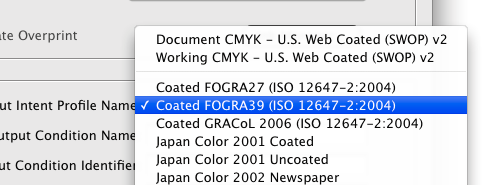
Photoshop CS4... convert to rgb to cmyk - fogra39
Indesign CS4... Prepare and export with pdf-x1a - fogra39
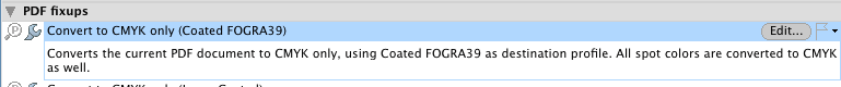
Acrobat 9... preflight against pdf-x1a - fogra39
Kodak Matchprint - simulation profile - fogra39
HP Designjet Z2100
Presstek DI /Heildelberg topsetter

Screenshots

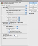
Photoshop settings (convert to settings are the same profile)
Picture9.png


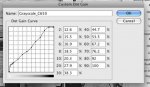
Indesign export pdf settings
Picture3-2.png


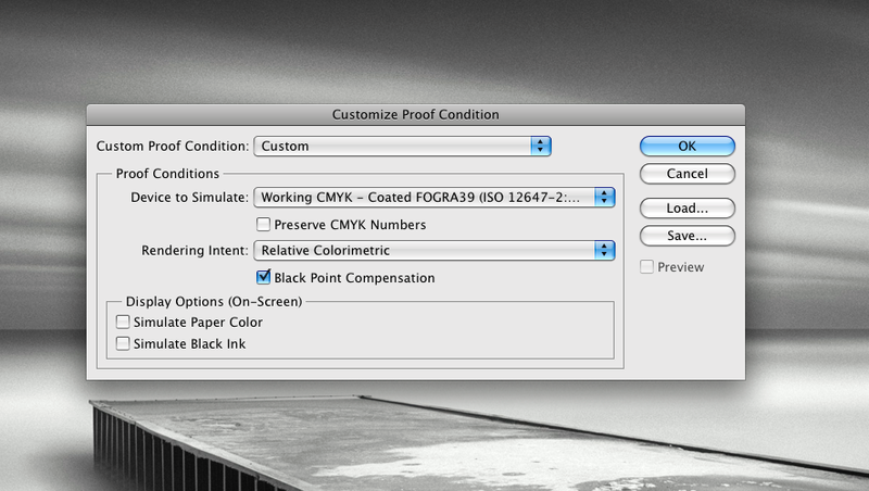
acrobat preflight settings
Picture2.png


Any idea's where i'm going wrong?
 
Last edited:
one thing I was thinking of when posting....

Could there be a different version of the fogra39 profile that would shift the color that much? (looks a little worse on screen vs the screenshot)

2nd thing....
Should I be turning off any color management until I get through acrobat / pitstop ?

Also I am trying to get the company to get into somewhat of a color management workflow and will soon be making custom icc profiles per press with different papers etc... , would this help/ solve the inconsistency problem?
 
Profiles aren't inconsistent, but workflows often are.choosing the fogra39 profile as you pdf output intent within InDesign does not control the color management within the application. And preflighting for an output intent within acrobat does not gurantee that the pdf is displayed with that profile.

Have you checked that the cmyk values have not changed between the cmyk file in Photoshop and the pdf?
 
Displaying you are not simulating InkBlack or paper colour? (you do not have preserve CMYK numbers so you are expecting to colour manage CMYK in your workflow?)
Do you have photoshop displaying with "desaturated colours"? Are you using proofing settings in Photoshop, InDesign and Acrobat?
In Acrobat are you what is your display profile (in the separations pannel)

(personally I would keep the PSD in RGB and only do conversion in InDesign, but would use the Proof setting and gamut warning while adjusting colours… this way I could choose differnt profiles for the job depending on what GCR I need and/or what Total Ink the paper/process allows. I find the Euroscale v2 300% is much more practical than the FOGRA 39 and it based on the same reference data)
 
If you want a color managed workflow, you are going about it all wrong :(.

Embed the profile (FOGRA39, in this case) into the image inside of Photoshop - that will ensure that it will ALWAYS be used to view it.

In InDesign, be sure to export as PDF/X-3 and "Keep profiles". that will ensure that the final PDF has the embedded profile in the image as well. (PDF/X-1a is about _NOT_ doing color management. PDF/X-3 is!)

In Acrobat, the image will view correctly. Even more so with Acrobat 9, which is PDF/X-aware.
 
Hmmm seems like I really need to dig into some color management books :)

Thanks guys, i'll keep those suggestions in mind and see if I can get it to work today.
 
Leonard PDF/x-3 is very dangerous advice if there is any transparency going on.
If you read the original post it is a PDFx1a that is the correct choice! IF the CMYK profile is consistently FOGRA 39 he should not be seeing that variation unless he is viewing the file differently.
The x-3 method will tumble as soon as you have a drop shadow or the like involved. PDFx3 is only good if you have your images in boxes and not interacting (transparently) with other elements in your design.
If you would have said x4 I would not have argued as x4 allows transparency, but does demand a RIP. There is still the issue of black point compensation however.

Again simulating Ink Black and Paper white WILL most definatly affect the appearance in the applications.
 
I checked it out further today and I think I found the problem....in indesign under Output>Color>Color Conversion, I had the "convert to destination" selected, by default. So once I turned that to no color conversion, it works fine.

Most of our files come in as pdf's but this one came in with native indesign documents.

I did try the pdf-x3 but it would not pass because of the transparency. We are using an older harlequin rip and and efi oneflow DI rip so we have to flatten before sending to the rip.

Definitely need to read some more and spend a day there to streamline the workflow......it's getting better at least, there used to be no color management and no preflighting.....yikes :eek:
 
The advantage with PDFx1 is you get what you see, and converting from a profile to the same profile can change colour the FOGRA profiles aren't perfect. since you know you are using images converted to CMYK for the same profile I do not see that you are breaking the rules in any way that will harm your work.
 
Embed the profile (FOGRA39, in this case) into the image inside of Photoshop - that will ensure that it will ALWAYS be used to view it.

Maybe I am wrong but I think that the default setting in InDesign is to keep the embedded profiles for RGB import but to ignore them for CMYK. If you don't change this parameter, you are not going to have a profile attached to an individual CMYK image in a PDF but only one profile for the whole file.
 
I checked my Photoshop CS4, and by default it will preserve the embedded profile, for RGB and CMYK. I have it set up to prompt me whenever the currently embedded profile does not match the working profile. Also prompts for files without embedded profiles.

Just for good measure, is this an ok setup for my photoshop settings?
 

Attachments

  • screen.jpg
    screen.jpg
    81.3 KB · Views: 234
FOGRA 39 is not compatible with 25% dotgain in gray.
FOGRA 39 has a dotgain maximum of 17% for black at 50-55%.
I would suspect you would have better sucess with 17% for spot color too!

Thierry, it should be no problem if the CMYK profile is ignored in InDesign as the Output intent is the same, so there should be no conversion. If all CMYK is FOGRA 39 it should be sufficient to have FOGRA 39 as output intent and all CMYK as device, since the device is with the output intent.

In all apps are you viewing proofed colours? Are you checking in "simulate ink black" and "simulate paper white"?
 
Last edited:
FOGRA 39 is not compatible with 25% dotgain in gray.
FOGRA 39 has a dotgain maximum of 17% for black at 50-55%.
I would suspect you would have better sucess with 17% for spot color too!

One could also use the black printer of the CMYK color space to define the gray and spot profiles. Select "Load Gray" from the drop down menu and select the Fogra39 profile.
 
Thanks meddington & Lukas!

While searching about this "Load Gray" (never noticed that before!) I stumbled across this article.
It discuses it in more detail and also discuses creating a dot gain profile with ColorPort. :)

I was just using Fogra39 because it seemed to match our sheetfed press closer to swop v2.

I will have to look into ColorPort a little further and figure out how to create a profile with the iOne pro that is sitting around....problem is, no one knows how to use it.....yet.
 
FOGRA 39

In all apps are you viewing proofed colours? Are you checking in "simulate ink black" and "simulate paper white"?

Yes I usually keep them on, but is it supposed to look duller than the printed version? I'm using a 24" coloredge eizo, calibrated with a iOne pro.

The hard copy always looks more vibrant no matter which profile is used. Though we don't have any viewer boxes so I cant compare them side by side since the lights are dimmed.
 
Yes I usually keep them on, but is it supposed to look duller than the printed version?

A few thing contribute to compromise the softproof with paper white simulation. 1. The ui elements and dialog boxes do not map there white points in kind and remain nice and bright in comparison, 2. The luminace of the monitor is often much lower than the illumination of the proof, And 3. Watching the transition from hi dynamic relative mapping of the default softproof to low dynamic absolute mapping of the "paper white" softproof makes it difficult to get the first preview out of your mind. So view in full screen with no ui elements showing, lower the luminace of the viewing booth if possible to match that of the monitor, and turn your head when choosing "paper white". ;)

That said there is often still some discrepancies.
 
Last edited:
I tried making a custom dotgain profile using the iOne Pro and colorport like the link in my last post...but when I go to switch it to another gray profile, it disappears. Also I cant use it in other programs.

Is it possible to create my own icc profile without buying extra software?

My company has an iOne Pro, no gretagMcbeth software except diagnostic tools. I'm not sure if it came with the efi rip or not. Eyeone Match does not let me use it, asking to licensee the iOne first...which I cant find any licensing info anywhere....

There is also Creo Harmony on another unused rip.... would this be of any use?

i'm willing to read as much as needed, will be getting some color mang. books real soon.

Any help or direction would be highly appreciated :)
 
I tried making a custom dotgain profile using the iOne Pro and colorport like the link in my last post...but when I go to switch it to another gray profile, it disappears. Also I cant use it in other programs.

After you create the profile (either "Custom gray" or "Load Gray") you can save the profile by selecting "Save Gray" from the drop down menu. Save it to your Library/Colorsync/Profiles folder and it will be available in the drop down if you swtich gray profiles. Might have to close color settings and re-open for it to show up on the drop down menu.
 
Thanks Meddington, that did the trick!

I tried it out on a copier and it did seem to print it darker and muddier than the soft proof. I did use have photoshop manage color managment, and selected the grayscale as the print profile, and the copier might be using 4c black.....I left it on default. The default 20% dotgain seemed closest.

am I entering in the values correctly? I wanna make sure I have this down before wasting plates :)

Values (Copy Machine)

.0126
.155
.169
.185
.203
.279
.383
.447
.535
.672
.762
.926
1.146
 

Attachments

  • Picture 1.jpg
    Picture 1.jpg
    27.6 KB · Views: 203

PressWise

A 30-day Fix for Managed Chaos

As any print professional knows, printing can be managed chaos. Software that solves multiple problems and provides measurable and monetizable value has a direct impact on the bottom-line.

“We reduced order entry costs by about 40%.” Significant savings in a shop that turns about 500 jobs a month.


Learn how…….

   
Back
Top