Delta E

tamale

Active member
I have a supplier with whom I have a complaint with colour variation in a 4 colour process . He states that his colour is within spec at a Delta E of 5.

My experience is with density and not spectrophotometry.

Is a Delta E of 5 good? What is the industry standard in the matter?

Thanks,

Tamale
 
I have a supplier with whom I have a complaint with colour variation in a 4 colour process . He states that his colour is within spec at a Delta E of 5.

My experience is with density and not spectrophotometry.

Is a Delta E of 5 good? What is the industry standard in the matter?

Thanks,

Tamale


The industry spec, ISO 12647-2 for tolerance is for a Delta E <5 for solid ink patches.

Are you talking about variation through the press run? Is the printer saying that an individual press sheet is within a Delta E <5 for solid ink patches? How does the printer know that through the run the variation isn't greater than 5? Is your complaint about color variation in the live image area?
 
There is no industry standard. Delta E is a measurement based on lab value that measures the absolute difference between two colors. It's a useful tool because it is an objective measurement of how different two colors are.

For most colors 5 dE is noticeable. Basically, you and your supplier don't agree about how close the match should be. The supplier is saying he believes a tolerance of 5 dE is acceptable. You disagree. I'm sure you can find somebody who can match an agreed upon target color to better than 5 dE. For example, I could promise you that 90% of your job will be within 3 dE of your target or I owe you a discount. Then there's no arguing about who is right, just pull samples and measure them.

Of course they might charge more than your current supplier.
 
There is no industry standard.

Could you elaborate on this (which is likely what the printer is referencing):

Tolerance_zpsc4awuwus.jpg
 
The industry spec, ISO 12647-2 for tolerance is for a Delta E <5 for solid ink patches.

Are you talking about variation through the press run? Is the printer saying that an individual press sheet is within a Delta E <5 for solid ink patches? How does the printer know that through the run the variation isn't greater than 5? Is your complaint about color variation in the live image area?


The issue is with a label printed with a cmyk yellow-gold background. On the new order we just received the colour is now a reddish-beige and they claim it is within tolerance.
 
The issue is with a label printed with a cmyk yellow-gold background. On the new order we just received the colour is now a reddish-beige and they claim it is within tolerance.


A few things...

If it's a repeat order then the target color for the press operator should be a sample of the previous job with documentation as to your expectations for color match.

If the image was a specified screen tint graphic (e.g. like vector art) then it wouldn't have had any GCR applied to help stabilize the color as would happen with a raster image separated in, for example, PShop.

As D Ink Man noted a Delta E of 5 is a huge tolerance window - and this applies to solid ink patches. You can be within tolerance for solid ink patches in color bars but that does not mean that specific areas of color in the live image area are within that same tolerance. Also it is harder to see differences when colors are very saturated like those in the solid ink patches. It is easy to experience and see a difference when colors are near neutral or screened back (e.g. pastels).

From your description it sounds like the problem is a lack of effective communication regarding setting expectations for the job.

Its a repeat order but they changed the screen angles on the M and Y because of an apparent moiré. We have not seen any moiré in the previous orders.
 
Its a repeat order but they changed the screen angles on the M and Y because of an apparent moiré. We have not seen any moiré in the previous orders.


Interesting...

Screen angle shouldn't affect color unless there is a printing issue like slur or doubling. You would need a strong loupe to see if that was the case with either the original or the repeat order.

Is the moiré image subject or screen angle that they were trying to "fix". I.e. is the moiré they refer to caused by the halftone screen clashing with the image itself or is the moiré the result of the halftone screens clashing with one another?

Do you know what angles they normally use and what they changed to?
Here is a pic they sent . Is it me or is Screening angles.png.jpg there a difference in the two yellow screens?
 
Here is a pic they sent . Is it me or is there a difference in the two yellow screens?

OK, Here's the step by step so that my thinking and conclusion can be challenged.

First I traced the direction of the CMY dots:

1Traced%20angles_zpsh5tovjh2.jpg


Then I moved them to common centers so that I could measure the angles:
2Lines%20centered_zps8v0ssd8f.jpg


Then I rotated each by the same amount (-15°) in order to make the Yellow the reference at 90°
3Lines%20rotated%20so%20Y%20at%2090_zpsy0hlsmlw.jpg


Then I overlaid black lines at standard angles - 90°, 15°, 45°, 75°
4Black%20reference_zpsdot6jqf2.jpg


What this does seems to indicate that the M angle stayed the same at 45°. The C angle stayed the same (at 30° ! ). But the Y angle was moved 15°

So their old relative screen angle set was:
C: 30°, M: 45°, Y: 0° - This could lead to a C/M screen moiré (C only 15° away from M)

Their new relative screen angle set was:
C: 30°, M: 45°, Y: 15° This could lead to a C/M and C/Y screen moiré (C only 15° away from M and C only 15° away from Y. BTW C being 15° away from Y is a standard compromise. Because Y is so light and typically run at 108% of the other screen lpis the C/Y moiré is usually not noticeable.)

So, if I'm right, they've gone from the possibility of having one screening moiré to the possibility of having two screening moirés.

Could these differences in screen angle cause a shift in color? Yes, because it shifts the overprints of the CMY colors which in turn can shift color. Also, if there is a C/M moiré caused by the new screen angle set, that moiré can show up as a periodic shift in color. I.e. over the distance of the repeating moiré pattern the colors will shift at those points.

Something is very wrong here.

On a sidebar. To bring the Y to 90° I had to rotate the angle set by -15°. Some vendor angle sets are rotated by 7.5° (to avoid single channel moiré). It's interesting that the 15° happens to be 2x the 7.5° rotation. I don't know why that was done.

I also checked the lpis of the two versions - they are the same.
 
Last edited:
Questions:

As these are labels, how were they produced? Offset or flexo? They could also be digital too I guess.

EDIT: The 7.5° shift of angle is common in flexo to avoid moiré with the anilox.

Is the background considered to be the most important feature of the label, from a colour reproduction perspective? What I mean is, without seeing the label it is hard to know how critical a background colour may be in the context of the unseen job. To me, a background colour could be very critical, or incidental – depending on the job or the person making an evaluation.

In say food packaging, there is usually a good reason why packaging backgrounds are printed in a spot colour…


Stephen Marsh
 
Last edited:
Attached is a sample from the provided image, however it is not known if both photos were taken under exactly the same white balance conditions, so this may or may not be an accurate test.

Stephen Marsh


sample-no-wb.jpg
 
Attached is a sample from the provided image, however it is not known if both photos were taken under exactly the same white balance conditions, so this may or may not be an accurate test.

Stephen Marsh


So I repeated Stephen's test but white balanced the two versions (BTW sure looks like offset not flexo)

This is what I got:

ColorsAveraged_zpswdar2rbv.jpg


and the Delta E

Color%20difference_zpstb1gfqqc.jpg


Delta E 1976 would be the most used industry method.

Of course this is spiralling into speculation since we don't have anything to actually measure. But it's a interesting exercise none the less.
 
Last edited:
No Title

On my color Tool....

Delta E 1976 for Stephan Marsh sample was 4.000
and gordo's sample was 7.3485.
 

Attachments

  • photo4853.jpg
    photo4853.jpg
    6.1 KB · Views: 346
  • photo4854.jpg
    photo4854.jpg
    6.1 KB · Views: 331
Last edited:
Attached is a sample from the provided image, however it is not known if both photos were taken under exactly the same white balance conditions, so this may or may not be an accurate test.

Stephen Marsh


Close Stephen, there numbers result in db76: 4.18. They are using de2000, please refer to the email containing the data they sent.
 

Attachments

  • Supplier email.pdf
    304.9 KB · Views: 373
Questions:

As these are labels, how were they produced? Offset or flexo? They could also be digital too I guess.

EDIT: The 7.5° shift of angle is common in flexo to avoid moiré with the anilox.

Is the background considered to be the most important feature of the label, from a colour reproduction perspective? What I mean is, without seeing the label it is hard to know how critical a background colour may be in the context of the unseen job. To me, a background colour could be very critical, or incidental – depending on the job or the person making an evaluation.

In say food packaging, there is usually a good reason why packaging backgrounds are printed in a spot colour…


Stephen Marsh
Stephen,

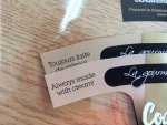
The labels are produced in sheetfed offset with non uv inks. The substrate is BOPP (Biaxially oriented polypropylene) Here is a pic of the label in question laid on top of the first production run.

Tamale
 

Attachments

  • IMG_0094.JPG
    IMG_0094.JPG
    117.3 KB · Views: 374
OK, Here's the step by step so that my thinking and conclusion can be challenged.

First I traced the direction of the CMY dots:

1Traced%20angles_zpsh5tovjh2.jpg


Then I moved them to common centers so that I could measure the angles:
2Lines%20centered_zps8v0ssd8f.jpg


Then I rotated each by the same amount (-15°) in order to make the Yellow the reference at 90°
3Lines%20rotated%20so%20Y%20at%2090_zpsy0hlsmlw.jpg


Then I overlaid black lines at standard angles - 90°, 15°, 45°, 75°
4Black%20reference_zpsdot6jqf2.jpg


What this does seems to indicate that the M angle stayed the same at 45°. The C angle stayed the same (at 30° ! ). But the Y angle was moved 15°

So their old relative screen angle set was:
C: 30°, M: 45°, Y: 0° - This could lead to a C/M screen moiré (C only 15° away from M)

Their new relative screen angle set was:
C: 30°, M: 45°, Y: 15° This could lead to a C/M and C/Y screen moiré (C only 15° away from M and C only 15° away from Y. BTW C being 15° away from Y is a standard compromise. Because Y is so light and typically run at 108% of the other screen lpis the C/Y moiré is usually not noticeable.)

So, if I'm right, they've gone from the possibility of having one screening moiré to the possibility of having two screening moirés.

Could these differences in screen angle cause a shift in color? Yes, because it shifts the overprints of the CMY colors which in turn can shift color. Also, if there is a C/M moiré caused by the new screen angle set, that moiré can show up as a periodic shift in color. I.e. over the distance of the repeating moiré pattern the colors will shift at those points.

Something is very wrong here.

On a sidebar. To bring the Y to 90° I had to rotate the angle set by -15°. Some vendor angle sets are rotated by 7.5° (to avoid single channel moiré). It's interesting that the 15° happens to be 2x the 7.5° rotation. I don't know why that was done.

I also checked the lpis of the two versions - they are the same.


Thanks Gordo, this is a great exercise, I can use this information in my questions to them.

Tamale
 
Close Stephen, there numbers result in db76: 4.18. They are using de2000, please refer to the email containing the data they sent.


As you can see in the Color Difference Calculator - if you change the formula for how the difference is calculated you change the apparent level of match. In this case Delta E 76 says the colors are quite different but Delta E 2000 says its a close match.

Related to the printer's email - some things that could help...

1 - Change the screen build. In this case to incorporate heavy GCR to help stabilize the color. As an example to show the principle, I don't know what screen values you are actually using, however, based on the graphic that you provided the specified screen tint values are:

28% C
39% M
60% Y
14% K

You'll get the same final color appearance if you used:

0C
22M
45Y
40K

However, by removing Cyan and putting the M and Y tones lighter than 50% and by using K instead - the color on press will be more stable and easier for the press operator to control.

Or:

2 - Use a spot color instead of a process screen tint build

And:

3- The vendor writes: "We've acquired a new screening method that uses a digital corrected printing plate, where the ink dots are placed on calculated places to avoid color
differences due to registration shifts or interference of the screens." This reads like they're trying to obfuscate the use of FM screening.
FM screening will help to stabilize the color and avoid color differences due to registration shifts and eliminate moiré due to the interference of the screens with AM/XM screening.
Personally, I would not want them to experiment with my job. If they're committed to getting better results with all their customers then they should be looking at switching all their work to FM screening.
 

PressWise

A 30-day Fix for Managed Chaos

As any print professional knows, printing can be managed chaos. Software that solves multiple problems and provides measurable and monetizable value has a direct impact on the bottom-line.

“We reduced order entry costs by about 40%.” Significant savings in a shop that turns about 500 jobs a month.


Learn how…….

   
Back
Top