Profesional color corrective work

russpears

Well-known member
What tools do some of these prepress companies use to make localized adjustments and intricate masking? If I am looking to remove 9% Cyan in one area of an image are the color separators using simple masking and levels or are they using more specific tools for particular ends? Does anyone do this type of work?
 
Of course, it depends on the image. Anything from a color range mask to a hand cut pen tool path. We do this kind of thing all the time.
 
I can imagine how the character of the edges will play into the decision to use a pen tool mask or a graded soft edge, or if the color target is a localized or diffused, but in respects to the actual changes what do you rely on the most to make color moves for sensitive color work? I can imagine color range to reduce some type of sun burn on skin, but once that is done and the customer requests a change to warm the skin slightly and open up the shadow detail what do you use? Also if the Total Ink limit is also a concern do you think -Cyan and Black would be a better move than adding more Magenta or Yellow?
 
Hi Russpears,

You mentioned Total Ink in your last post. Just curious - are you toning images in RGB or CMYK. Ideally images should be toned in RGB as RGB is more similar to how our eyes see color. Once your images are toned, the conversion to CMYK should automatically take care of your Total Ink Limit assuming you are using the appropriate ICC profile.
 
I would think that various areas of an image will have values that exceed a total Ink Limit of say 320. (ex: 90 C, 100 M, 100 Y, 50 K color build) I was told that any color sensitive work has to be done in CMYK and that relaying on any print profile to make further adjustments on output is almost counter productive given the number of color rounds some companies do like my example where one would want to open up the shadow detail by 2 or 3%. All that money in both photography, loose proofs and composite proofs could be lost to one print profile output made any adjustments what so ever, don't you think?
 
I find using selective colour works well in your scenario. It may require a crude selection area or a precise one depending on the image components. Or a combination of selective colour and curves and yes, I prefer working in CMYK in part because of my long time experience with CMYK, (I am considered by some, a dino). Key is to save as each revision level so you can return to any round as the customer's whim dictates.
Either removing colour, say minus cyan (lightens) or adding the opposite colours, in this case, magenta, yellow (darkens); the judicious use of black can also be the saviour. As I work a lot with folding carton cardboard, GCR as an approach which voids a channel or nearly voids a channel is also powerful. Dark blues and or purples are best void of yellow when printing on recycled board, as are magenta in greens or cyan in reds, hence GCR the image.
My two cents worth,
J
 
Hi Russpears,

It depends on your workflow. Everyone has a different definitions of what they consider "high-end". To be honest, photographers would rather work in RAW where they have much more control of highlights, shadows, skin tones, etc. than working in RGB or CMYK. I don't want to generalize but the old school of thought was everything should be adjusted in CMYK. Things have changed over the years.

I wouldn't say "relying on print profiles to make further adjustments on output" is technically correct. The image should be adjusted first in RGB or RAW. These colorspaces have a larger color gamut than CMYK. If they are working in Photoshop they can toggle a CMYK preview of the CMYK output so there are no surprises. When the file is finally converted to CMYK, it maps the current colors to CMYK. The out of gamut colors will be mapped differently depending on if you use relative colorimetric or perceptual rendering intents. You can find out more info here: Color Management: Color Space Conversion

Again, workflows will vary per shop. This method will convert your source colorspace (e.g. RGB, RAW) to your destination color space (CMYK) during output which is very useful if you go to different output devices. It will make sure your colors are in-gamut and within total ink limits. If you always print to the same standard (e.g. Fogra, SWOP, etc.) it may not be as beneficial but that's a whole different conversation.

Long story short, there is no absolute way of doing things. It will vary by provider. Keep in mind that your printer may also use ink-reduction software than can completely alter your CMYK values but still provide a close/identical spectral match so that you'd never know the difference.

Greg
 
I would think that various areas of an image will have values that exceed a total Ink Limit of say 320. (ex: 90 C, 100 M, 100 Y, 50 K color build) I was told that any color sensitive work has to be done in CMYK and that relaying on any print profile to make further adjustments on output is almost counter productive given the number of color rounds some companies do like my example where one would want to open up the shadow detail by 2 or 3%.

I would disagree. Do the color work in RGB. If you perform your edits on an RGB working file, then you will never exceed the total ink limit. Yes, you must maintain a copy of the RGB file, but that allows you to perform non-destructive edits and to repurpose the file for other uses at a later date. It's important to note that those CMYK edits, even the tiny ones, are destructive - they reduce the number of available levels per color channel which can eventually lead to banding and similar artifacts.

"…any color sensitive work has to be done in CMYK…" I would imagine the person who told you this has a long history of making very small adjustments in CMYK. I've worked with people in those kinds of environments and once they made the transition to RGB scanning and color editing they saw a great deal of benefit. Some folks see the need for those tiny adjustments go away when they embrace RGB color work. If you need to see the CMYK percentages, you can set up your Info pallet to display the CMYK values after conversion. That can help A LOT in easing the transition over to RGB color editing.

You asked about warming and cooling skin tones and the question of adding MY or pulling CK. I prefer to work with the Hue/Saturation tool. Adjust the hue of the area or manipulate the Red component. To me this is a much more direct way to communicate with the software. Instead of telling the software to add or remove any particular component, you're telling the software to make a color warmer. Then you can let the software worry about how it does this.
 
Last edited:
Rich, are you saying that by doing color work in RGB I can perform your edits on an RGB working file and never exceed the total ink limit. Even if I have values like R 256, G 256, B 256 they convert to C 75, M 68, Y 67, K 90? Now my Total Ink Limit setting is safe because my color settings are set, I agree, But every color edit you do in RGB will also be changed on output.

Now for normal work I can agree let the computer decide-but it seems that the decision will have hold true for everything using the same rendering intent. If had critical color edits I did with a file how can working in RGB be best? I see that you want to be able to have a file for more than one process and any CMYK conversion is destructive, but as a production artists and graphic designer I know there are times where a client has very thorough color rounds and history of decisions about their gold’s looking more warm or less green etc. How do you keep the color from shifting in MORE unexpected ways when converting to CMYK from all of the RGB edits?
 
Greg or Rich, I can see how you can take a client request to -m slightly in a Hue & Saturation Adjustment layer, but how do you take out 2% Magenta using the same layer adjustment?
 
We do extremely critical color work, and much of it is done using a RGB workflow. The key I have found is a great monitor (Eizo CG245W), and soft proofing in Photoshop. Great profiles (with the correct TAC for the given process) and knowing when to use Perceptual rendering vs. Relative rendering are also key. I still tweak the CMYK file on occasion, but the majority of the color work is done to the RGB image.
Regards,
Todd
 
Greg or Rich, I can see how you can take a client request to -m slightly in a Hue & Saturation Adjustment layer, but how do you take out 2% Magenta using the same layer adjustment?

You can use whatever told you're comfortable with: selective color, hue sat, whatever you want... As long as the operator has their info palette window open, they can dynamically view the changes in CMYK (assuming they have the correct CMYK profile assigned to their working space). They should be able to see a change in the Magenta value...
 
Local editing can be achieved but I fear than other parts will also be affected. With regards to tools that can do this type of editing, I think most of the softwares can help you with this since this sounds like a minor editing.
 
How do you keep the color from shifting in MORE unexpected ways when converting to CMYK from all of the RGB edits?

It's a matter of setting up your soft-proofing preferences. If you have your soft-proofing set up to match your conversion settings, then you shouldn't see anything "shift".

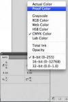
Set up the secondary readout on your Info pallet to Proof Color (see the attached screen grab) and that will show you the CMYK values after conversion following the parameters in your Proof Setup. If you just set it to CMYK, it will show you the values after conversion using your Color Settings.
 

Attachments

  • Picture 5.jpg
    Picture 5.jpg
    9 KB · Views: 165
Greg or Rich, I can see how you can take a client request to -m slightly in a Hue & Saturation Adjustment layer, but how do you take out 2% Magenta using the same layer adjustment?

I've found that its often less important that one concentrates on absolute ink percentages and views the correction based on the desired visual result. "Minus magenta" often simply means "too red" and can be effectively edited in RGB in a number of ways. Often when a client annotates a proof with a "-m", a more appropriate correction is needed anyway, such as a "+c&y" or other correction that leads to a comparable visual result. Interpreting corrections based on the desired visual result and not concentrating on stringent ink percentages, in my experience, can lead to faster approval/fewer proofing cycles. Your milage may vary.
 
Be aware of which icc profiles you use to convert rgb to cmyk and on what kind of paper you will print. For very critical clean cmyk values, you will have to correct in cmyk. If you correct in rgb, you'll find that after conversion to cmyk the cmyk values will differ from what you've chosen. For instance: 90M/80Y will turn into 3C/92M/78Y/2K or something like that. If you choose a specific color for print, don't switch to rgb again, because, depending on what icc profile you use and what that particular profile does, the cmyk values will change.

Cheers!
 
If I'm making a color correction to a localized area that doesn't have clearly defined hard edges, I like to make my change with an Adjustment layer (you can use Levels, Curves, Hue/Sat, Selective Color, etc. as Adjustment Layers.) Initially this will apply the correction to the entire image, but the Adjustment Layer has a built-in layer mask, so you can simply fill the mask with black to hide the adjustment, then take a soft paintbrush and paint with white on the mask to gradually apply the correction wherever you want it. This is a great way to avoid sudden shifts, and is completely live so you can come back and make minor tweaks (provided you save with layers).

As for what are the best tools, it really depends on the image and what you're trying to accomplish. I use the ones I listed above most often, or sometimes I use a combination of 2 or more of them.
 
Do you have a list of proofing marks that are useful for Color Rounds? Also keeping it all non destructive make sense, but then I have to ask: Do you work in RGB or CMYK? and your working color modes are they set for the particular print profile and paper combination so that you can do some basic Soft Proofing using the Gamut Warning in Photoshop)?
 

PressWise

A 30-day Fix for Managed Chaos

As any print professional knows, printing can be managed chaos. Software that solves multiple problems and provides measurable and monetizable value has a direct impact on the bottom-line.

“We reduced order entry costs by about 40%.” Significant savings in a shop that turns about 500 jobs a month.


Learn how…….

   
Back
Top