More V180 problems

cmyk burnley

Well-known member
Hi guys

Having more issues with this xerox v180 (sigh)

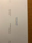
I received a business card job from a client, it has a smallish font size say 10pt.

Its in a grey colour. Now i keep getting faded edges on the font itself. Its only a monserat font. Nothing fancy.

Ive tried changing the grey swatch, ive tried outlining the font. Everything i can think of and still the same.

Using a 350gsm uncoated board. Normally gives such a nice finish.

Pulling my hair out!
 
Hi Guys

Image attached. As you can see from the fonts, the bottom last bit of all words starts to fade

IMG_20200107_133230.jpg
 
That's not faded. You're using a dot pattern to create a grey on a thin font so it will appear washed out or pixelated. You might have some success with different halftone screen settings in the fiery.
 
In your fiery under the image tab, you should have Printer Screen Mode (mine is set to "Enhanced Text" by default)
and Text/Graphics Edge Enhancement

I sometimes get better results on grey text by adjusting these settings.

If you rotate the job 180 does the fading move to the top edge?
 
Agree with the others - I would have a play with the halftone settings in the Image tab on Fiery. You should be able to get an acceptable result with one of the settings there.
 
So far I have tried...

Every Half tone Simulation in the image tab
Every Printer Screen Mode

Even tried a custom halftone simulation

Still the same really. Only slight quality improvements but still not great.

Would anyone mind running a text on their machine? See what they get?
 

Attachments

  • Dave - Business Card Software.pdf
    109.1 KB · Views: 373
Not sure if it's much help, as I don't run a Xerox, but I've run it on my Ricoh Pro C5200 using 200 line + fine text. Could probably get it a bit better with some playing around as this was just the first print, but not showing the same issue as yours. As I say however, not much help as it's not on a V180!!!! Printed on Novatech 350gsm Matt.
 

Attachments

  • IMG_0211 (002).jpg
    IMG_0211 (002).jpg
    908.1 KB · Views: 383
Last edited:
I've attached a test off our V80. Printed on 350gsm DCP (smooth bright white).

Looks a little darker in photo, sorry phone camera is crap, printed more as Cool Grey 7/8 but you can see in the test coverage is pretty even.

With my print screen mode as "Enhanced Text" I did get slight fade off at the bottom like your print but changing this to 200dot improved it to attached. I wouldn't hesitate in sending it out to a client.
 

Attachments

  • TEST.jpg
    TEST.jpg
    858.5 KB · Views: 412
Last edited:
oh i can see it now.

the half tone simulations do create different effects. Wish I knew what they were haha!

I cant wait for the colour grey to go out of fashion!
 
Have you tried APPE on and off.

I have seen a strange happenings when the font has a tint of gray behind it as opposed to no tint creates a different thickness in the font when they are vector. If I bitmapped the font somewhere in the process it would not do that. So try bitmapping that type and see what happens.
 
FWIW, i get this same problem with Myriad Italic at 8 or 9 pt. I ended up changing our cards in-house to semibold ital and it helps a bit, but not much. And i've tried the screen switcheroo too. My print is a PMS 144 orange. solid greyscale black has no issues. very strange.
 
Hi guys

Having more issues with this xerox v180 (sigh)

I received a business card job from a client, it has a smallish font size say 10pt.

Its in a grey colour. Now i keep getting faded edges on the font itself. Its only a monserat font. Nothing fancy.

Ive tried changing the grey swatch, ive tried outlining the font. Everything i can think of and still the same.

Using a 350gsm uncoated board. Normally gives such a nice finish.

Pulling my hair out!

Hello. things you must do. First, convert to outlines before printing. Then, adjusment in the attached file
 

Attachments

  • V180_V3100 Small Fonts Fiery Recommended SettingsLR.pdf
    296.7 KB · Views: 449
Not sure if it's much help, as I don't run a Xerox, but I've run it on my Ricoh Pro C5200 using 200 line + fine text. Could probably get it a bit better with some playing around as this was just the first print, but not showing the same issue as yours. As I say however, not much help as it's not on a V180!!!! Printed on Novatech 350gsm Matt.


you're right. Text in 200 line, graphics in 200 dot. Best choice.
 
Using line screens usually help in these kind of problems. On Konica machines there is a function to overcome the problem – it's a special setting buried somewhere deep on the engine UI.
 
oh i can see it now.

the half tone simulations do create different effects. Wish I knew what they were haha!

I cant wait for the colour grey to go out of fashion!

our V2100 has done that since new and still does it with 6,000,000 clicks on the counter. Our C75 and our Ricohs don’t do this. Try using 150 line to minimize it. if memory serves, there is also an enhanced edge setting in the RIP that puts a very faint outline around the font to try and hide this.
 
I've had a similar problem on my Versant 80 with small tinted text. I would try setting the image quality to 'Normal' instead of 'Best' and I'd also try rotating the business card 90 degrees to that it prints the other way round.
 

PressWise

A 30-day Fix for Managed Chaos

As any print professional knows, printing can be managed chaos. Software that solves multiple problems and provides measurable and monetizable value has a direct impact on the bottom-line.

“We reduced order entry costs by about 40%.” Significant savings in a shop that turns about 500 jobs a month.


Learn how…….

   
Back
Top